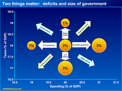
I don't agree with his politics but I like Keith Hennessey's graphs. Last week he Introduced Budget Bubble Graphs. He explains it all in the post but they look something like this:
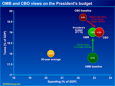
The circles show the size of the deficit as a percentage of GDP. Then this week he used them to ask Does the President’s budget increase the deficit or reduce it?. The graphs let him compare the CBO and OMB estimates and show their baselines.
I haven't looked into his data (though his posts do seem to do a good job of separating fact from opinion) and I'm curious to see where GOP proposals fall on these graphs.


No comments:
Post a Comment