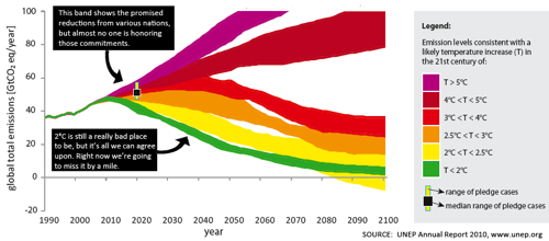
"See that 5 degrees Celsius we're projected to hit by 2050? That's 9 degrees Fahrenheit. That means the end of human civilization, and possibly of the human race itself. Within our lifetimes."
Sadly I didn't follow the links and explore it more. I already know that climate change is bad, as in very bad. But this chart did make me wonder…
What if someone, maybe a scientist or a journalist, made a chart in Fahrenheit instead of Celsius so that the average US resident or, say, politician would understand it just slightly better. Would it make a difference? Is it worth trying?
No comments:
Post a Comment