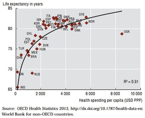
This is the most depressing graph in American health care "The chart, from a 2013 report, maps what countries spend per-person on health care against how long people in those countries live. It captures two long-standing truths about the American system: the United States consistently ranks way above peer nations in health care spending, but also ranks way behind in health care outcomes."

No comments:
Post a Comment