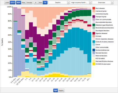
"What diseases and injuries cause the most death and disability globally? Compare how each cause affects specific age groups or regions in terms of death and disability. You can change age group or region, year, and metric to view results for absolute numbers, rates, and percentages. You also have the option to further explore each cause group and view specific diseases, injuries, or risk factors - click the navigation buttons at the top of the chart to use it"
You can look at the data a bunch of different ways but this was most interesting to me:

No comments:
Post a Comment