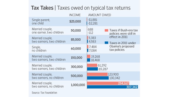
"The chart above (from The Wall Street Journal) might help you make sense of the debate. It shows what taxes will be like for different earners in 2011 if we renew the Bush tax cuts (that's the red bar) and if we adopt Obama's proposal (that's the blue bar). As you can see, Obama's proposal would actually lower taxes for many less wealthy people."
The article has another interesting chart as well.
No comments:
Post a Comment