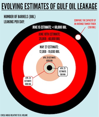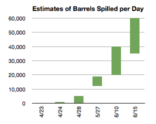
I don't think Tufte would be happy with the chart done as "circle areas relative to oil volume". Area is two dimensional and while volume is three, in this case it's a scalar. Here's my version using their data:

Notes from Howard's Sabbatical from Working. The name comes from a 1998 lunch conversation. Someone asked if everything man knew was on the web. I answered "no" and off the top of my head said "Fidel Castro's favorite color". About every 6-12 months I've searched for this. It doesn't show up in the first 50 Google results (this blog is finally first for that search), AskJeeves says it's: red.


3 comments:
Yours is better. The circle chart is also too evocative of a bulls eye. I found myself looking to the center for the important information when it was actually at the edge. You chart removes the pretty picture attempt to tug on my emotions and just gets down to the information of it.
The list of things Tufte wouldn't like is probably very long, as we all (except for your chart today) keep producing more of it.
The circles are a good approach, but executed dumbly. Yes, volume involves three dimensions (sphere), but to better illustrate changes in volume visually, the use of 2 dimensional grpahics (such as area) is very effective.
They should have presented the "volume circles" not nested, but separately. This aids greatly when trying to illustrate relative difference.
If they had done that, then the differences in spill rate estimates would be, visually speaking, immediately recognizable, understandable, and very alarming,
TT
No no, you need to enter the church of Tufte. Using area to show a scalar quantity misrepresents the difference, exaggerating x as x^2.
I went to lookup a quote and found some things I forgot. His complaint was typically about making charts be 3D and while the height or area was right, the perception of volume distorted the information. In this case area is shown relative to the number so it's not so bad (it would be worse if diameter was the barrel count).
But he also said that in tests different people perceive area differently and hence it's in general not a good representation to use when unnecessary.
While I agree the chart colors make it too bullseye-like, I personally find it easier to compare the areas as overlays than if they were side-by-side.
I can't find it now but my fav so far has been a world map with blotches over areas affected by big spills. The one from the 1991 Gulf War was the biggest by far.
Post a Comment